
The Two Spider Noirs

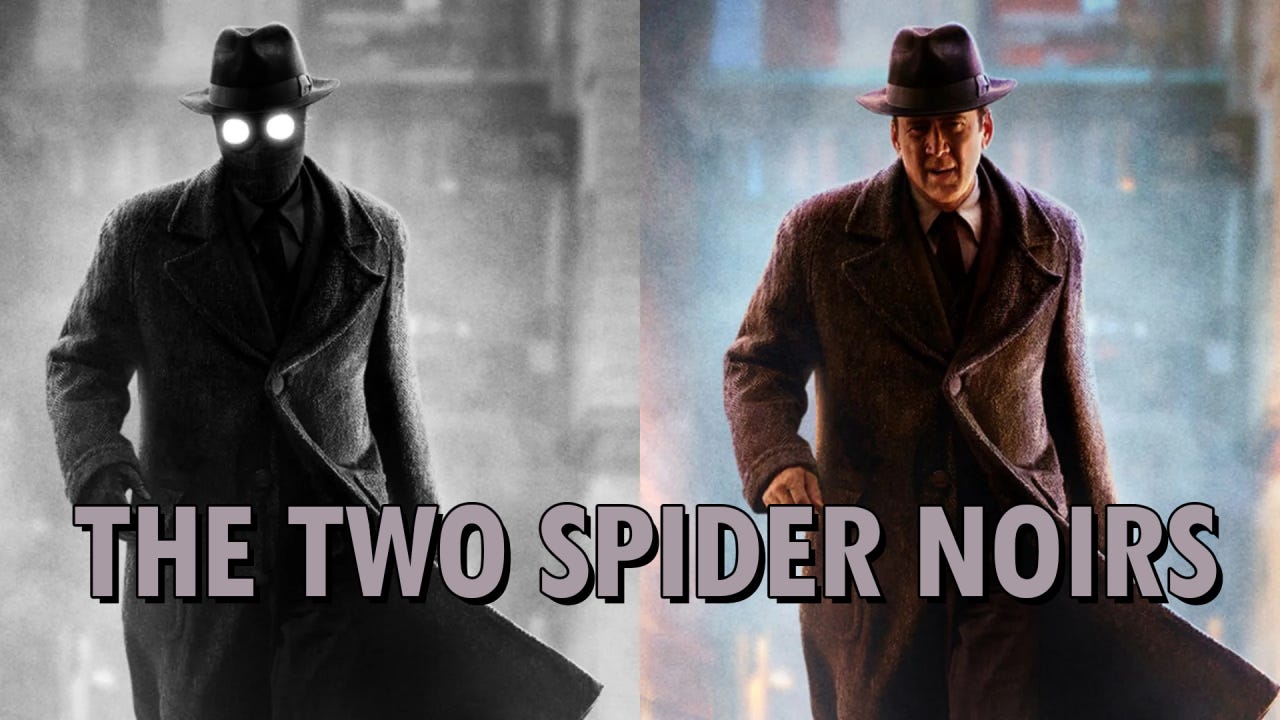
The Color Version Is The Real Mystery
I have never been particularly drawn to superhero films. That is not meant as a dismissal of the craft behind them, because many of them are enormous achievements of planning, production management, visual effects, animation, stunt work, sound design and postproduction. Yet after decades of cinematic universes, reboots, multiverses and increasingly elaborate threats to the fate of existence itself, I often find myself watching less a film than a machine whose movements I have learned to predict. The costumes change, the villains change, the render quality improves, but the deeper experience often feels familiar long before the story has reached its end.
Film noir is different for me. Noir does not need the city to collapse in order to suggest that a world has gone wrong. A staircase, a shadow, a face half hidden by light, a room that feels too quiet and a person making the wrong decision for reasons they only half understand can be enough. Noir is not only a period look or a decorative set of visual clichés. At its best, it is a way of making uncertainty visible.
That is why Spider Noir caught my attention. Not because it was another superhero project, but because it seemed to be approaching that exhausted territory through a visual tradition that still has weight. What truly interested me, however, was not simply that the series would use black and white. It was the announcement that it would exist in both black and white and color.
At first glance, this sounds almost like hesitation. If black and white is the artistic idea, why create a color version at all? If color is necessary to reach the audience, how strong is the commitment to the noir identity? It would be easy to dismiss the whole decision as streaming platform insurance, a way of giving cinephiles the monochrome version while keeping a more familiar color version available for viewers who might otherwise avoid the show. That explanation is probably part of the truth. It is simply not enough.
The more interesting question is not why a platform might want a color version. That part is obvious. The more interesting question is why the production appears to have taken both versions seriously enough to build a complex workflow around them. If the color version were merely a safety copy, the process could have been far simpler. Shoot the show in color, finish it normally, then create a black and white pass. Or shoot a pure monochrome project and let the color version become a secondary compromise. Both routes would have been easier than what Spider Noir seems to have attempted.
Not A Colorization Trick
The production did not begin with a black and white master and then colorize it later. That would have created an enormous amount of work across a television series, especially if costumes, faces, props, smoke, atmosphere, lighting shifts and background details had to be tracked and controlled shot by shot. Nor does the available information suggest that the color version was created through some automated colorization process applied to a monochrome image. The essential technical decision was more practical and much more revealing: the series was shot digitally in color on Sony Venice 2 cameras, preserving full color information from the beginning, while the visual development and monitoring process treated black and white as a central creative condition.
That changes the entire nature of the problem. The filmmakers were not trying to bring color back into an image after throwing it away. They were capturing a rich color source that could support two different outcomes, while designing the production so that the black and white version would not feel like a desaturated afterthought. In that sense, color was not the opposite of noir. Color became part of the engineering underneath the noir image.
This is the part that makes Spider Noir more interesting than a simple style announcement. The production was not creating one image and two exports. It was trying to create one production that could survive inside two visual systems.
What Color Normally Does For You
Black and white and color do not merely differ in mood. They organize the image differently. In color, hue performs a great deal of invisible labor. A red coat can separate from a green wall even when both have similar brightness. A warm face can stand apart from a cool background. A blue object can pull attention through a busy frame. Costume designers, production designers and cinematographers use such relationships constantly, sometimes consciously and sometimes through experience, taste and habit. Color gives the image hierarchy, direction and spatial separation.
Once color disappears, many of those relationships disappear with it. Two objects that seemed distinct may collapse into nearly the same gray value. A background that felt quiet in color may become visually noisy in monochrome. A costume that separated beautifully by hue may suddenly merge with the wall behind it. The image has not simply lost decoration. It has lost one of its organizing systems.
That is why the black and white button is such a misleading idea. The software can remove saturation immediately, but it cannot repair an image that was never designed to live without hue. Separation must come from light, contrast, texture, atmosphere, blocking, lens behavior and tonal design. The foreground and background can no longer rely on color alone. Faces need a different relationship to the surrounding space. Shadows stop being only mood and become structure.
Anyone who has lit for black and white knows this instinctively. You do not merely use the same setup and remove color at the end. You think differently, because the image will read differently.
Designing Backwards From Monochrome
Spider Noir appears to have taken this seriously from the beginning. Darran Tiernan has described a process that effectively reversed the usual assumption. Instead of starting with a color world and asking how it could become black and white, the production asked what a black and white world could become in color. That reversal is the key to the whole case study. Monochrome was not a cosmetic treatment waiting in the grading suite. It was a condition that travelled through the production.
The team spent months developing the look, including custom LUTs that allowed the image to be evaluated in both directions. There were black and white LUTs and color LUTs, and the set workflow often prioritized the monochrome image. Takes were commonly watched first in black and white, while the color version could be checked separately through the DIT and monitoring pipeline. This is not a minor technical detail. On a set, the monitor is not simply a screen. It is a decision making instrument. It tells the cinematographer whether the contrast is working, whether the actor separates from the background, whether the texture is readable, whether the face carries the scene, whether the frame has depth. If that monitor is primarily showing black and white, the entire production starts responding to monochrome logic.
That logic did not stop with the camera department. Costume and production design tested fabrics, colors and textures through cameras, lighting setups and high resolution monitors so that choices could be judged through both versions of the image. This is exactly the kind of work that separates a serious dual version production from a postproduction trick. A fabric that looks elegant in color may become dull in black and white. A wall color that seems tasteful by eye may produce the wrong gray value against a costume. A color that looks almost ridiculous on set may become exactly the right tonal separation through the LUT.
One hotel room set makes the point almost perfectly. It used colors such as lime green and electric blue, a combination that seemed too extreme when people first walked onto the set. Through the camera and the production pipeline, however, those colors produced the tonal relationships the black and white image needed. That is the fascinating paradox. The production was using color to control monochrome.
One Schedule, Two Masters
The moment the show had to exist in color as well, the problem became harder. If the filmmakers had only needed a black and white series, they could have optimized every decision for monochrome. They could have chosen strange colors purely for their gray values. They could have lit with even less concern for how the scene would appear in color. They could have allowed the real world on set to look bizarre, as long as the monochrome image worked.
But Spider Noir also needed a color version that did not feel like a technical leftover. That meant every major visual decision had to pass two tests. Does it work without hue? Does it still feel intentional when hue returns?
This is the practical contradiction at the center of the production. The black and white version appears to have been the conceptual heart of the project, but the color version could not be treated as disposable. The series had to satisfy viewers attracted by noir and viewers who might reject monochrome. It had to satisfy two audience strategies and two image systems inside one shooting schedule.
That is why the color version is not a side issue. It is the source of the difficulty.
Cameras, Lenses And Light
The camera choice makes sense only in that context. A true monochrome camera might offer theoretical advantages for a purely black and white project, because a monochrome sensor does not filter incoming light through the same color array as a standard color sensor. But Spider Noir was not only a black and white project. It needed the RGB information. It needed color channels that could later be interpreted, separated and shaped into different tonal relationships. Shooting on Sony Venice 2 preserved the data required for both versions while giving the colorist the material needed to design the monochrome response rather than merely remove saturation.
The lens and lighting choices reinforce the same idea. Reports mention vintage inspired optics, including Canon Rangefinder lenses, IronGlass Cine Blue Flare lenses and Lensbaby elements for selected effects. Tiernan has also spoken about the attraction of older rangefinder still lenses and the usefulness of deeper focus for noir staging. This was not a normal glossy superhero image with a noir filter placed over it. The optical choices were part of the attempt to create a period influenced visual world that could hold shadow, texture and depth.
The lighting followed the same principle. The cinematographers leaned into older lighting tools such as tungsten units, Fresnels, open face lights and HMIs rather than relying on a purely contemporary soft LED approach. That matters because noir is not simply darkness. Noir is controlled contrast. It needs hard edges, slashes of light, readable silhouettes and shadow shapes that organize the frame. In black and white, these qualities are not decoration. They become the architecture of the image.
This also explains why the LUTs were not just viewing conveniences. If a black and white LUT crushes or shapes shadows in a particular way, the cinematographer can light into that response. The LUT becomes part of the decision process. It changes how much fill is needed, how far a background can fall, how strongly a face can be cut by contrast and how much separation the image can hold before it becomes unreadable.
Black And White As A Color Process
The postproduction workflow continued the same logic. The show was finished through a high end Baselight grading pipeline at Picture Shop, with Pankaj Bajpai as colorist. What matters most is not simply the name of the software, but the philosophy Bajpai describes. He has called the creation of black and white a color process, which is exactly the point many people miss.
A serious monochrome grade is not merely desaturation. The RGB information captured by the camera can be used to decide how different colors become tones. Skin, fabric, paint, smoke, practical lights and shadows can all be shaped through their underlying color relationships. The final image may be black and white, but the route to that image still depends on color data.
Bajpai also worked with image scientists to create mathematical profiles inspired by historical black and white print behavior, including references such as Kodak TRI X. This does not mean Spider Noir simply copied one film stock. It means the production used the memory and behavior of photographic processes as a reference point while building a stylized contemporary image. There was even a separate black and white treatment for a World War I flashback, drawing on the idea of ENR style silver retention, with richer blacks and a different tonal density. That kind of work is far removed from pressing a button.
The color version had to be designed with equal care. If it looked like ordinary neutral color, it would immediately feel like a concession to viewers afraid of black and white. The reported intention was a period inspired, heightened color world, described as True Hue rather than naturalistic realism. That makes the color version less a fallback and more a parallel interpretation of the same production material.
The Compromise Is The Point
This is where the commercial reality becomes more interesting rather than less. Yes, the color version exists partly because black and white still carries audience risk. Nicolas Cage has said he advocated for dual formats because he did not want to turn off younger viewers who may not be familiar with monochrome. That should not be ignored or romanticized away. Streaming platforms live and die by viewer behavior, and viewer hesitation matters. A black and white superhero series, even with Nicolas Cage, is not an obvious mass audience proposition.
But the production response to that risk was not simply to dilute the concept. The team did not abandon black and white. They did not treat monochrome as a disposable novelty. Instead, they built a workflow that allowed the black and white version to remain central while making the color version viable enough to stand on its own.
That does not make the decision pure. It makes it modern. Contemporary production often lives in exactly this kind of conflict, where artistic identity, audience behavior, platform strategy and technical possibility all push against one another. Spider Noir is interesting because that conflict is visible in the pipeline. The two versions are not only a marketing strategy. They are not only an aesthetic experiment. They are both at once, and the workflow exists because both pressures had to be satisfied.
This is why I would not dismiss the dual release as a gimmick. A gimmick would have been easy. Shoot the show, remove the color, advertise the alternate version. Spider Noir appears to have done something more complicated. It treated black and white as a serious visual condition while refusing to let the color version become an afterthought. That is exactly what created the unusual production challenge.
The Image Does Not Obey The Button
If you decide late in the process that something should be black and white, the software will obey. The image may not. The costumes may not separate. The lighting may not carry enough structure. The production design may collapse into the wrong values. The face may no longer sit correctly inside the frame. The button will remove color, but it will not rebuild what color was doing.
Spider Noir matters because it seems to have understood this. It is not a case study in why every project needs two versions, and it is not an argument that black and white is automatically superior to color. It is a case study in what happens when two visual languages place demands on the same production system.
For someone like me, who came to the series more through noir than through superheroes, that is the most interesting part. Spider Noir did not suddenly make me a convert to superhero storytelling. But it did make me interested in a production problem that is more sophisticated than it first appears.
The irony is that the color version, which at first seemed to weaken the commitment to black and white, may actually reveal how serious that commitment was. If the filmmakers had not cared about black and white, they could have treated it as a postproduction novelty. If they had not cared about color, they could have let that version feel secondary. Instead, they built a workflow that tried to hold both together.
That is a much more interesting story than a superhero series being released in two formats. It is a reminder that images are not made by buttons. They are made by decisions. And the harder the decision, the farther it travels through the production.